Colour Psychology and Your Window Treatment
It’s true, colour plays a significant role in our lives. It can alter mood, incite anger, evoke happiness and even sadness to the extent it warrants for intensive study by psychologists and heavily adopted by interior designers and architects, under a study called – colour psychology. However, most of us don’t realise nor pay enough attention to the effects of colour in our homes or offices. Not only that colour and design in an interior space should reflect us, the people who live inside, but we should also use colours wisely to create the intended atmosphere in specific living space at home.
Want to introduce some colour psychology to your living space? No, that doesn’t mean you have to get buckets of paint and start painting. You can introduce colours with the help of furniture and window treatments. Here are some colour psychology inspiration for your Hunter Douglas window treatments to get you started:
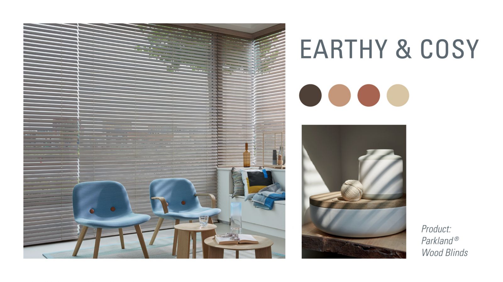
Earthy and Cosy
Earthy and cosy colours like brown and beige resemble nature’s tones that are proven to bring out the warmth and encourage connections. This would be perfect for interior space where people gather like the living room, these colour choices can help people get comfortable and open up for conversations. Since earthy and cosy tones are close to the neutral colours, it’s extremely easy to work them into your interior design or colour scheme. Constructed from the finest woods and alternative woods, our Parkland® Wood Blinds help you integrate the natural wood tones to complement your rooms at home. You can even bring a bit of nature to your home effortlessly while elevating your interactivity at these spaces.
.jpg)
Peaceful and Tranquil
Colours with blue tones like the turquoise or sky blue give off a calming effect. That’s why you tend to see these colours adopted by banks and insurance companies as these colours have the tendency to make you feel grounded. Consider incorporating these tranquil colours into living space like the bathroom as they would help you relax and unwind after a long day. For a space like this, we would recommend you to get ultimate versatility with our signature Duette® Honeycomb Shades through its expansive selection of cellular pleat sizes, opacities, colours, textures, and operating system, so you can keep exploring the right combination of window treatment to your heart’s content.
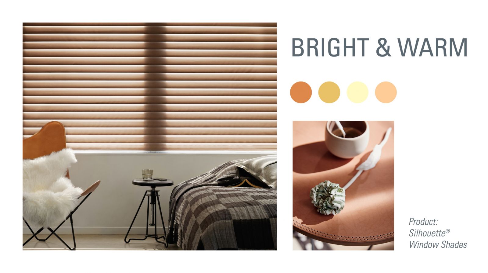
Bright and Warm
If you’re looking for something bright and warm, choose amber or peach for a positive and reassuring feeling. Contrary to the brighter counterpart – red, which excites the mood and encourages appetite, these warm colours exude a more optimistic outlook in life. Try adding a touch of bright and warm colours in your bedroom to a more productive morning after your well-deserved sleep. Go ahead and integrate these colours with our Hunter Douglas Silhouette ® Shades. The shade features unique horizontal, S-shaped vanes that appear to float between two sheer panels, beautifully dispersing light in your choice of colour to your bedroom – looks even better with the morning sun!
If you’re still unsure about the colour choice and the effects of colour to your living space, speak to our window specialists and we’ll be more than happy to advise you further on choosing the perfect colour and the right window treatment with Hunter Douglas.
